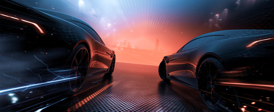
Rebranding is nothing new in the automotive industry. However, more and more car manufacturers are introducing redesigned logos as part of their strategy to adapt to a more digital, electrified world. Check out some of the latest logo designs. Which do you prefer, the old ones or the new?
Out with the old, in with the new…
BMW
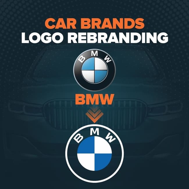
The German brand released its new minimalist logo in 2020. It replaced its classic logo from 1997 with a flat logo with a transparent background and simplistic white border. Although it has kept its traditional Bavarian colours and circular design, the updated design is more practical for both digital and physical applications. The transparent ring is supposed to represent “openness and clarity”.
KIA
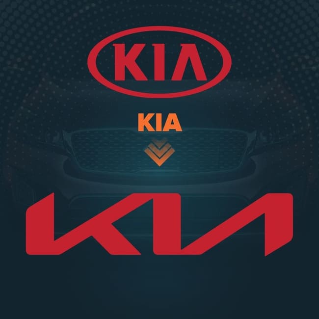
The new KIA logo was unveiled at the beginning of 2021 to represent the brand’s radical transformation. It swapped its oval logo for a modern angular design, which apparently represents “symmetry”, “rhythm” and “rising”. However, not everyone was so keen. Many people have confused the “K” for an “N” and some have pointed out that it looks slightly crooked.
RENAULT
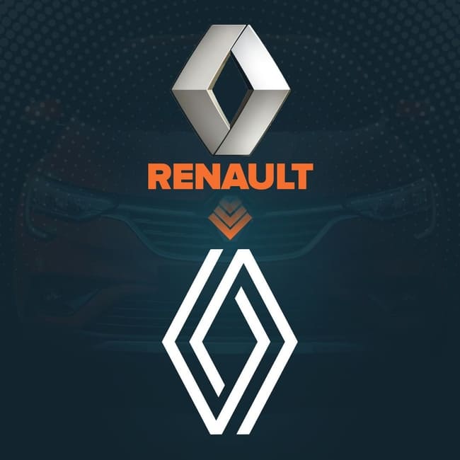
The distinctive diamond has been part of the Renault brand since 1925, and that isn’t about to change now. However, like other leading manufacturers, it has caught onto the flat logo trend and it released a new flat, geometric logo last year. The rebranding campaign signifies that the brand is “entering a new era” while maintaining its heritage.
VW
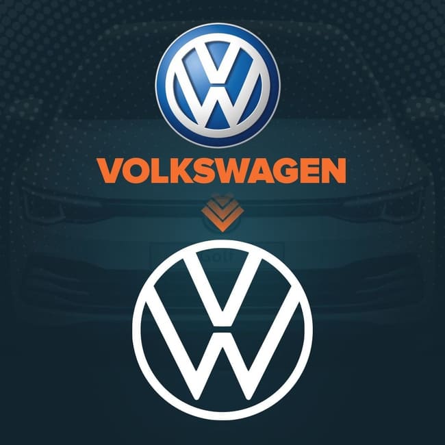
VW was among the first to adopt a 2-D logo under the motto“digital first” . The new logo is fundamentally the same as the old one, except it has been reworked for a cleaner look with thinner, lighter lines. Some say this is an attempt to visually distance the brand away from the diesel-emission scandal and move towards the digital EV era.
MINI
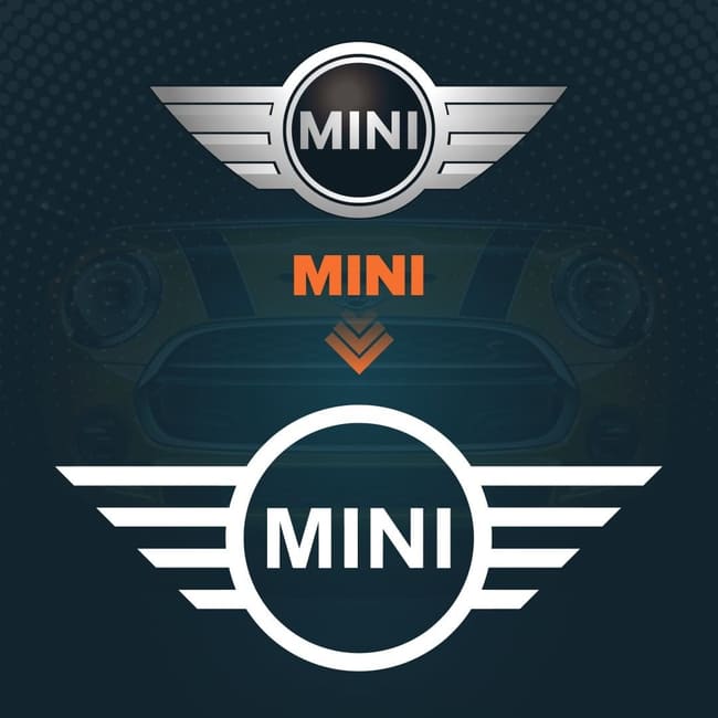
Yep, you guessed it, it’s flat. The Mini brand has kept its iconic winged logo, but opted for a simplified 2-D design. The rebranding move came as Peter Schwarzenbauer announced plans to transform Mini Cooper into an electric car brand.
NISSAN
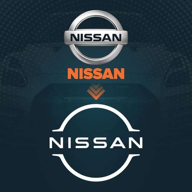
Japanese car manufacturer Nissan has jumped on the 2-D bandwagon, debuting its new logo on the Ariya electric crossover SUV. The thinner, more refined badge will be featured on all its new electric vehicles and lit up by 20 LEDs (representing the 20 years since the last logo was released).
PEUGEOT
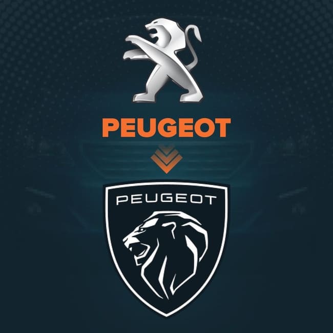
Peugeot’s logo changed drastically last year. The new logo is a blast from the past, resembling the brand’s 1960 coat of arms logo, but with a modern twist. Although it has received a lot of praise, critics note its similarity to other carmakers’ logos, e.g. Lamborghini.


Comment